
Developer · Step-by-step guide
How to Check Your Screen Size and Device Info
Device Info shows the details of the device and browser you are using right now: screen size, window size, browser, operating system and more. Handy for web designers and when tech support asks "what are you using?"
How to use it
Open the tool and look at the summary
The badges at the top show your device type, screen size, browser and operating system. It works on its own, with nothing to type.
Check the details
The tables below list screen size, available screen, window and viewport size, device pixel ratio, colour depth, orientation and the web features your browser supports.
Copy the report
Press Copy Full Report to copy everything as text, ready to paste into a support ticket or chat. Press Refresh Details after resizing the window or rotating your phone.
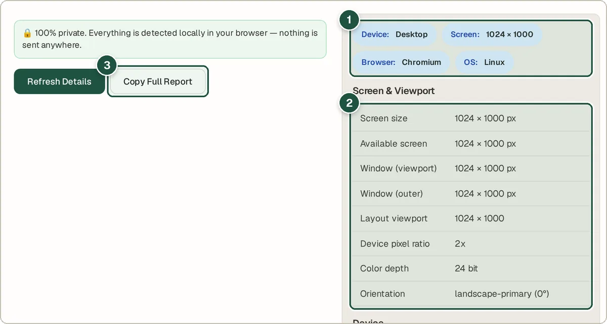
Summary badges (1), the screen and viewport table (2), and Copy Full Report (3).
Tips and common questions
Why is the screen size different from my monitor's resolution?
Browsers report size in CSS pixels. On high-resolution screens, one CSS pixel covers several real pixels. The device pixel ratio tells you how many.
What is the viewport?
The viewport is the part of the browser window that shows the web page. Web designers use it to decide how a page should look.
Can it tell my exact phone model?
Browsers share only limited details, so the model may be general (for example "iPhone") rather than exact.
Privacy
Everything is read from your own browser and shown only to you. Nothing is sent to a server.
Ready to try it? The Device Info & Screen Size Detector is free and needs no account.
Open the Device Info & Screen Size Detector